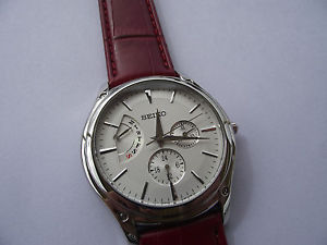
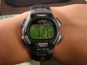
 Until a few years ago, I wore a wristwatch. Usually, a cheap Timex that was waterproof, with a back-lit digital display so I could see it at night. But after I got my first cell phone, the watch seemed unnecessary because the phone had a clock. Why carry two clocks around? I do have one nice wristwatch that I wear when I am dressed up for a special occasion. One such occasion happened a couple of weeks ago and it made me realize how much I love wearing a watch. I could check the time without having to get out my phone; consequently, I detached from my phone, because usually a check on the time leads to checking email and Twitter and Facebook. So now I want to get a watch for daily use, and in my search for a watch, I noticed that, much like with a website, I am trying to find the right balance of two things:
Style and Usability.
You want to like the way your watch looks: the color, the materials, the size, etc. But unlike a ring, necklace, or any other jewelry that are merely decorations, your watch actually has to perform a task. If a watch doesn’t tell you the time, it is not fulfilling its purpose: it’s just a decoration. Websites are the same way: if you go to a website but can’t find information or complete a task, it doesn’t matter how pretty the website is, because it has failed at its task.
Let’s look at some watches and talk about how they balance style and usability.
Analog – Minimalist
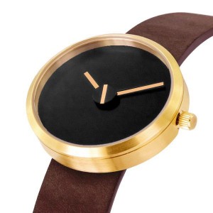
Usability: Poor
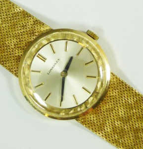
This watch has hands for the hour and minute, but nothing else: no second hand, no numbers or notches to indicate where the hands are pointing. It looks elegant, and its simplicity is attractive, but it depends on familiarity with a regular clock face in order to figure out what imaginary numbers it is pointing to. Even for someone who knows clock faces well, it takes longer to figure out the time because it makes you have to think.
Analog – Notches
Usability: Fair
This watch has notches instead of numbers. Like the previous example, this one depends on clock familiarity in order to know what number corresponds with each notch. The notches make it easier and faster to tell the time, but because there are no numbers, that process may take a second or two.
The double notch, along with the brand name, help you know which side of the watch is the top, because otherwise it would look the same from any angle, which would be disorienting.
Analog – Roman Numerals
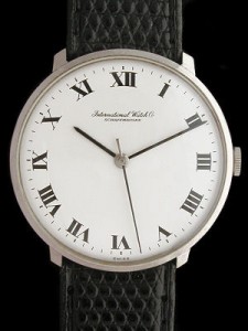
Roman numerals are common on watches, but since most people don’t use roman numerals in everyday life, its usability is questionable. Some may find it almost as useful as having regular numbers, but for others, it is not much more useful than simply having notches.
Notice that this watch increases its usability by having dashes between each number so you can easily tell exactly what minute it is, and includes a second hand.
Analog – Numbers
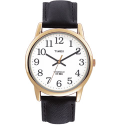
Now we are getting somewhere. All of the features of the previous watch except this one has the Arabic numerals we are familiar with. So far, this is the most efficient and usable watch design.
If I were to find one flaw with this particular watch it would be the lack of differentiation between the hour and minute hand. The hour hand is thicker and shorter, and the hour hand has a blunt end while the minute hand is pointed. These differences are subtle. It shouldn’t cause problems most of the time, but at a quick glance or in poor lighting, you might have to look closer to see which hand is which.
Analog – Complicated
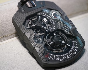
There are many kinds of watches that highlight the mechanical nature of the watch, or display the time in an unconventional way, with varying levels of usability. Here’s one of the wackiest I found. It looks interesting and sophisticated, but it takes some work to figure it out. It might be useful once you are used to it, but it confuses new users, forcing them to spend a lot of time figuring it out before being able to use it.
Analog – Extra Features
Some watches have added features, usually to tell you the date. Here’s an example that tells you the date, day of the week, and hour of the day (on a 24-hour clock). Notice that the day of the week dial is clear, but the date is less so, using tiny notches to represent most dates. All three dials are in the center of the clock face, which means they will occasionally be obscured by the hour and minute hands, decreasing their usability even more.
Digital
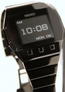 All analog watches suffer from the same usability flaw: they force the user to think. It may only take you a second to figure out the time, but a digital display does the same thing in a fraction of the time. It may not have the elegance of a traditional clock face, but when it comes to usability, it cannot be beaten. It’s a clock, and yet you don’t have to know how to use a clock in order to read it. This particular watch’s extra features are done very well too, the “AM” and “MON 06” are in a smaller typeface and a good distance from the time, so that they don’t interfere with you seeing the time clearly and easily.
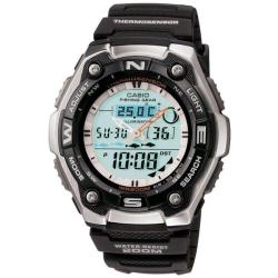 Digital watches vary greatly. Here is an example of a digital watch that tries to do a lot of things and, in the process, obscures the time display. It has a traditional analog display on top of a digital display that shows all sorts of information. I mean, is that thing in the upper right showing us the phase of the moon, for Pete’s sake? Notice how the analog clock hands do not stand out very well from the background: that’s because of poor contrast, something I’ve started noticing in watches. Having black hands on a white face makes it very easy to see where the hands are, but this light blue background with silver and gold hands makes them harder to see. The digital time display is at the bottom of the face and small, only taking up about 1/3 of the clock face. Now, granted, once you are used to this watch, your eyes go right to the time and it performs its functions successfully. But its flaws are in the unnecessary clutter around the clock. That clutter makes the time seem less important, as though it is merely one of the many pieces of information the watch is offering when it is actually the single most important thing.
Conclusion
Just like a watch, a web page can give users a lot of information, but it performs its task well when its design allows the user to find the single most important piece of information quickly and easily.
