“Users don’t scroll long pages.”
“People avoid pages with a lot of content.”
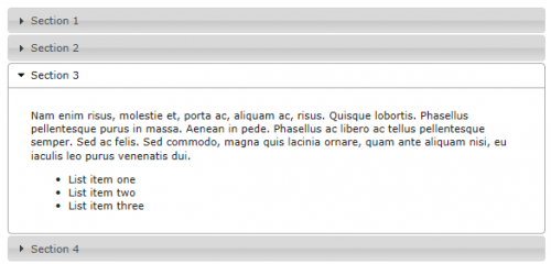
These are two common misconceptions about website content debunked in a recent article by the Nielsen Norman Group. The article focuses on accordion menus, and how studies have shown that the use of accordion menus to show and hide blocks of content, in order to keep the page length short, are often less helpful than simply displaying all of the content, even if it creates a long page.
The problems with accordion menus are the sometimes cumbersome interactivity, the increased interaction cost accrued by forcing people to click to see each bit of content, that hiding content reduces users’ awareness of it, various accessibility issues, and the inability to print a physical copy of the content. To be fair, the article says that accordions can be useful in some situations, such as when people only need “a few key pieces of content on a single page” or for smaller screens, such as phones, because it is more difficult for one’s eye to scan through content and people on small screens tend to stop scrolling before they get to the end of a very long page.
In the early years of the web, it is true that users disliked having to scroll. It turns out that is no longer true.
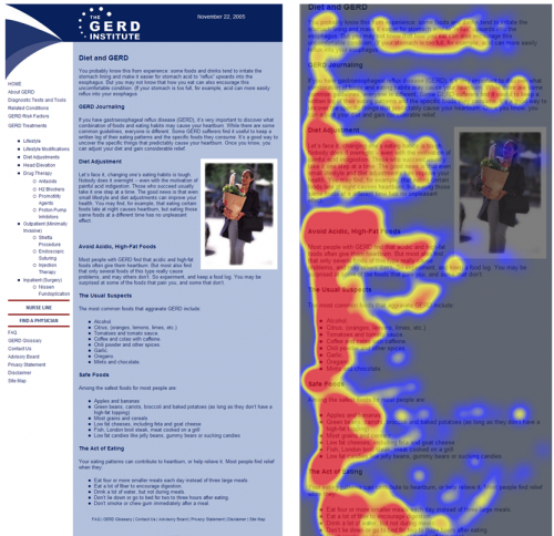
“Users do scroll when the content is relevant, organized properly, and formatted for ease of scanning.”
This eyetracking example shows how users interact with a long page that is properly formatted.
For the average website content manager, the most important takeaway from this article is the importance of well-organized text, formatted for scanning. Web users still spend 80% of their time looking for information “above the fold” but they do scroll, spending 20% of their attention below the fold.
Read the article “Accordions Are Not Always the Answer for Complex Content on Desktops”

