I was reminded the other day that it has been a while since I’ve posted, so hint received. To be honest, I’ve been nose deep into modeling and computer coding, which isn’t that scintillating.
A personal note: It was warmer last week (above freezing) – but cloudy with a lot of snow. This week is sunny and cold. It is good to see the sun! Also last week I was skating and the kids were sliding at the school. I was almost ready to come in (and perhaps a little overconfident in my skating ability) when I slipped on the ice and fell backwards – knocking my head. That was painful (both on my tailbone and the head). I don’t think I had a concussion – and the tailbone is finally feeling better – but sheesh! Looking back, that slip-up did throw me for a loop.
On Monday I started teaching my data visualization seminar (online) – it meets weekly-ish (the days of the week vary). It was fun to get back to the practice of teaching – albeit online. I’ve taught this course for three consecutive years at Augsburg – so it feels comfortable teaching. This was been the third stretch of teaching online for me (once last spring, a summer course, fall semester 2020, and now). Truth be told, it feels less awkward to do then it did even last fall. I do long for the day to be back in the classroom, but we are making it work.
A diagram that I showed my class is the following:
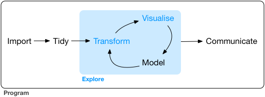
(Wickham and Grolemund, R for Data Science)
I think about this diagram a lot when doing research. A lot of my work consists of iterating through a model (starting with a rough approximation à refining the model à collecting data to confirm the model or help it run) and then iterating through over and over. Many times it feels like this:

The biggest challenge is trying to find the correct data to work with. My project focuses on developing a model for soil carbon dioxide for forests in the Yukon. These forests lie along a fire chronosequence – one was burned in 2012, 1990, and 1969. We want to know differences between how the forest has recovered in its soil.
In order to build a mathematical model, some of the data I need includes soil temperature, soil moisture (as a percentage of saturation), and aboveground photosynthesis. A lot of these data are available from NASA (MODIS) or the Soil Moisture Active Passive mission – both satellites that orbit the earth. Pretty neat stuff to be working with. For example, here are some plots I made this week:
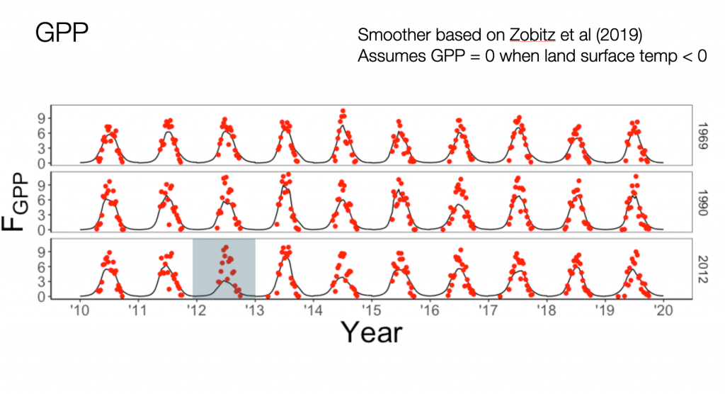
This graph represents photosynthesis – so how much carbon the ecosystem is removing from the atmosphere. I like graphs like these – the red dots are data products from the satellite, but the black line is a smoother I developed. Each of the panels represents a different site I am focusing on – the year refers to when it was burned by forest fire.
The soil temperature with a graph laid out similarly is the following:
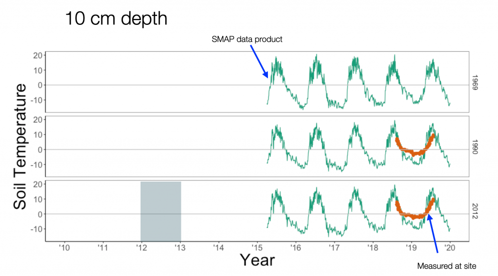
(The green line is a satellite data product, the brown-ish orange line is based on plot measurements taken at the sites (from Koster et al 2017).
I was excited to see how the directly measured data matched up closely with the satellite data product. When ground-based measurements are approximately equal that makes me happy.
The last measurement I need is soil moisture, from the same satellite data product:
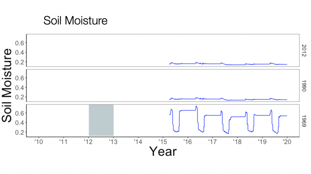
(The scale ranges from 0 to 1; so 0 means completely dry soil, 1 saturated). Ok, not so great news. The site 1969 shows some variation (I would expect it to be constant during the summer months, but sites 2012 and 1990 are pretty flat.
That is to be expected when working with satellite data – while we hope it to be continuous, these data products are derived at a fundamental level from surface reflectance measurements and highly processed (if you want to dig into the details you can look here). Clouds and other factors obfuscate the satellite measurement.
So what to do? Well I am currently looking into other ways to compute soil moisture (leaky bucket models here we come!). Soil temperature can be modeled as a diffusion problem. More work and … you guess it more coding.
Onwards.